Every AI App Looks the Same. This app helped me fix it.
AI tools default to the same generic look. Here's how getdesign.md helped me give Claude Code a real point of view when I rebuilt my site.
A while back I wrote about the future of DevRel, and one idea from it has been rattling around my head ever since. When everyone builds with the same handful of AI models, everything starts to look the same. Adam Wathan, who created Tailwind, joked that he'd like to formally apologize for making every button in Tailwind UI indigo five years ago. That one default is now baked into what feels like every AI-generated interface on earth. Ask an AI to build you an app and you'll probably get an indigo button too.
I made the case back then that this is actually good news, in a way. When the baseline gets automated, taste becomes the differentiator. Easy to write. Much harder to live, as I found out the moment I sat down to rebuild this very website.
Rebuilding my own site, I hit the sameness head-on
I wanted quintonwall.com to feel like a clean, document-style site. Think Notion's marketing pages, or the Claude and Codex interfaces: white space, calm type, nothing shouting at you. I had a clear picture in my head. I just couldn't get it out of the model.
So I did what most of us do now. I opened Claude Code and described what I wanted. And I got back something perfectly competent. Rounded cards, a hero section, a gradient I didn't ask for, and yes, buttons in a familiar shade of blue-purple. It wasn't bad. That was the problem. It was fine in the exact way ten thousand other AI-generated sites are fine. If I'd shown you the result next to a random startup's landing page, you couldn't have told them apart.
I'd run straight into my own argument. The AI had given me the average of every site it had ever seen, and the average is forgettable.
I wanted a point of view, not a default
The thing is, "well-designed" and "designed with a point of view" are not the same. AI is genuinely good at the first one. Spacing is even, contrast passes, the layout doesn't break on mobile. But ask it for an opinion about design and it reaches for the median, because the median is the safest guess.
I had references in my head: the restraint of Notion, the quiet confidence of Stripe's docs, the way Figma's own product feels considered without being loud. What I didn't have was a way to hand any of that to the model. "Make it look like Notion" is a vibe, not an instruction. The AI needs something concrete: actual color tokens, type scales, spacing rules, the principles behind why a design feels the way it does. I'm not a designer. I couldn't write that brief myself.
Finding getdesign.md
I went looking for someone who'd already done the work, and that's how I came across getdesign.md. It's a collection of production-grade design systems broken down into DESIGN.md files, structured markdown that an AI coding agent can actually read and follow. The format is based on Google's DESIGN.md spec, so it's not someone's loose notes. It's a real specification.
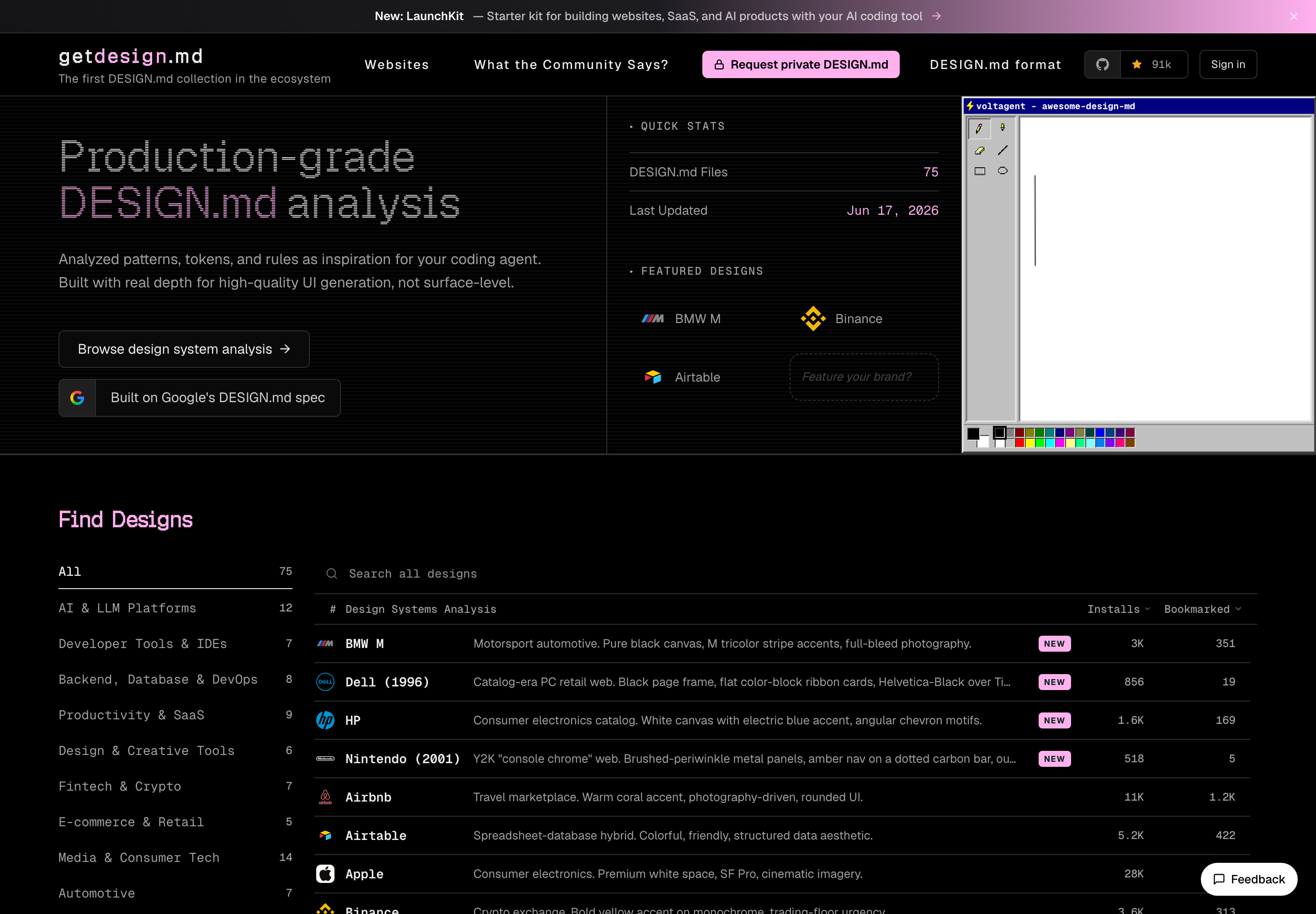
There are 75-plus systems on there: Stripe, Figma, Apple, BMW, and a long list of others. Each one is pulled apart into the pieces that matter to a model. Color systems and tokens. Typography rules. UI patterns. The actual aesthetic principles, written down. Instead of a screenshot you squint at, you get machine-readable design guidance you can drop into your prompt or your repo.
That distinction matters. A screenshot tells the AI what something looks like. A DESIGN.md tells it why, and the why is what survives translation into code.
Using it to find inspiration for clean, modern design
Here's how I actually used it. I browsed the systems that matched the direction I wanted, the calm and document-like ones, and read how they handled the fundamentals. Where Stripe sets its type scale. How restrained the borders and surfaces are when a design feels expensive instead of busy. Then I pulled those tokens and principles and fed them to Claude Code as the reference, instead of letting it fall back to its own defaults.
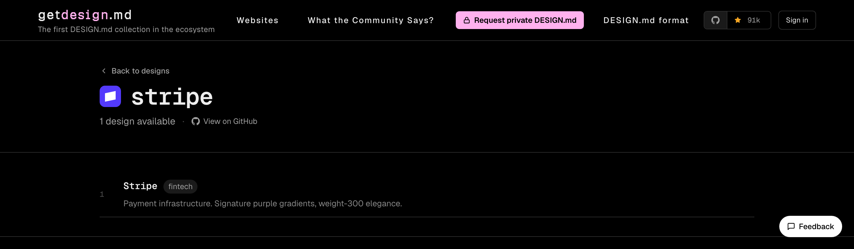
That little summary line, "signature purple gradients, weight-300 elegance," is the kind of thing I could never have written into a prompt myself. It's exactly the point of view the model was missing.
The shift was immediate. Same tool, same me, completely different output. Once Claude Code had real constraints to work inside, an actual color palette, a spacing system, a stated preference for white space over decoration, it stopped handing me the generic SaaS template. It started building the site I had in my head. The indigo button was gone. So was the gradient nobody asked for.
I wasn't asking the AI to be creative. I was giving it taste to borrow, and letting it do the part it's good at: turning a clear brief into clean code, fast.
Killing the sameness, one borrowed point of view at a time
I'm never going to be a designer. That's just true. But the whole worry from my earlier post, that AI flattens everything toward the same look, turns out to have a pretty direct answer. The sameness isn't the model's fault. It's what you get when you hand the model nothing and let it guess.
getdesign.md is one of the better ways I've found to hand it something instead. It doesn't make me a designer and it doesn't replace taste. It gives the AI a point of view to work from, which is exactly what was missing. The baseline is automated now, the same way I said it would be. So the move is to feed your tools a real opinion about design and let them carry it. I'll never sketch a beautiful layout from scratch. But with the right reference in hand, Claude Code can help me stand out from everyone shipping the same indigo button.